

The slider is one of the most common UI elements on the web and in mobile applications. Used to select a value or range of values, it provides a better user experience by visualizing the data connected to the slider.
Sliders are helpful when providing a variety of options, such as selecting a specific price range, tracking a package shipment, or completing a form.
In this post, we will create different sliders using react-slider, a React headless component that’s easy to build and customize.
react-slider is a small, accessible, CSS-agnostic component that helps us build customized slider components for React applications. It uses the render props pattern under the hood to provide a headless UI for our application.
Let’s get started with the react-slider component by installing the following package:
npm install react-slider
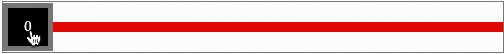
Once we install the package and render the component in our application. The default slider component looks like the slider below:
Later on, we can use the default code for this slider to customize it:
<ReactSlider
className=”horizontal-slider”
thumbClassName=”example-thumb”
trackClassName=”example-track”
renderThumb={(props, state) => <div {…props}>{state.valueNow}</div>}
/>
With the slider package installed, we can review the three major parts that make up the slider: track, mark, and thumb.
The track is the horizontal line that connects the slider parts. To customize the track, we can add a class name, like trackClassName, or render a custom component, like renderTrack. Using a class name, we can customize the style of the track component.
But, if we want to have control over the track, we must render a custom component and change it based on our requirements. For example, rendering a custom component controls updating the user that a value changes from X to Y.
We can write our own functionalities on top of that, such as updating a parent component state.
Here’s an example of using both a class name and rendering a custom component:
<ReactSlider
className=”horizontal-slider”
thumbClassName=”example-thumb”
trackClassName=”example-track”
renderTrack={(props, state) => <div {…props} />}//custom track
/>
The thumb is the element that slides on the track, which we can also customize with a class name or render a custom component using the render props method.
The mark is a step inside the slider that renders along with the track to update progress or status. It’s useful when we want to build a progress-based slider.
This is similar to a progress bar but it has intermediate steps. Each step requires us to complete an action, before proceeding to the next step.
Here, we have a vertical slider with each step designated by a mark.
We can customize the marks in two ways: either providing a class name or rendering our customized mark component using render props.
So far, we have covered all the major parts of react-slider. Now, let’s implement them inside a React application with a few common use cases.
To begin building a slider in React with the react-slider component, create a file named slider.js in the root folder and add the following code:
import ReactSlider from “react-slider”;
const Slider = () => {
return (
<ReactSlider
className=”horizontal-slider”
thumbClassName=”example-thumb”
trackClassName=”example-track”
/>
);
};
export default Slider;
Here, we provide three CSS class names that customize the thumb, track, and slider:
.horizontal-slider {
width: 100%;
max-width: 500px;
height: 100vh;
margin: auto;
}
.example-thumb {
cursor: pointer;
position: absolute;
z-index: 100;
background: #ffffff;
border: 5px solid #3774ff;
border-radius: 100%;
display: block;
box-shadow: 0 0 2px 0 rgb(0 0 0 / 44%);
}
.example-thumb.active {
background-color: grey;
}
.example-track {
position: relative;
background: #ddd;
}
.example-track.example-track-0 {
background: #83a9ff;
}
.horizontal-slider .example-track {
top: 20px;
height: 4px;
}
.horizontal-slider .example-thumb {
top: 12px;
width: 10px;
outline: none;
height: 10px;
line-height: 38px;
}
With the slider styled, there are two important things to note here: the example-thumb and example-track class names only provide styling for the track and thumb components.
To style a track from Mark 1 to Mark 2, we can add a style using the class name example-track.example-track-0. We will discuss this in detail when creating a vertical slider.
With the customization complete, we finished the simple slider; find the complete code and rendering here.
We can also build a vertical slider using the react-slider component. Vertical sliders often show progress. For example, many ecommerce sites use vertical sliders to show the progression of packages delivered through the mail.
An example of a React vertical slider we will build can be found here.
Vertical sliders, like horizontal sliders, have three components: a step, slider, and form.
Create a step.js file and add the following code to render each of the five steps. As we can see from the image above, we have five steps in the design. So, we must add a steps array with values in it. Based on the active element, we can render the respective value:
import React from “react”;
const steps = [“Step 1”, “Step 2”, “Step 3”, “Step 4”, “Step 5″];
const Step = ({ currentIndex }) => {
return (
<div className=”steps-container”>
{steps.map((step, index) => {
let color = currentIndex === index ? “#00d4ff” : “black”;
console.log(“color”, color);
return (
<div className=”steps-item”>
<h3
style={{
margin: 0,
color: color
}}
>
{step}
</h3>
</div>
);
})}
</div>
);
};
export default Step;
Here, we have the currentIndex props that we pass from the parent component. It holds the value of the currently active element in the slider. For example, if the second mark is active, currentIndex is 1.
Based on that, we can render and style the value from the steps array.
To add a vertical slider, add Slider/index.js in the root folder and add the following code:
import React from “react”;
import ReactSlider from “react-slider”;
import “../styles.css”;
import “./slider.css”;
const Slider = ({ onChange, currentIndex }) => {
return (
<ReactSlider
className=”vertical-slider”
markClassName=”example-mark”
onChange={onChange}
trackClassName=”example-track”
defaultValue={0}
value={currentIndex}
min={0}
max={4}
marks
renderMark={(props) => {
if (props.key < currentIndex) {
props.className = “example-mark example-mark-completed”;
} else if (props.key === currentIndex) {
props.className = “example-mark example-mark-active”;
}
return <span {…props} />;
}}
orientation=”vertical”
/>
);
};
export default Slider;
We can then import ReactSlider and pass some properties into it. Let’s explore them in detail.
The className prop determines whether the slider is horizontal or vertical and we can style it like so:
.vertical-slider {
height: 380px;
width: 25%;
}
Customizing the marker on each step can be done via the markClassName property. We can use className to style it or we can style our custom component and pass it as render props inside react-slider:
.example-mark {
width: 8px;
height: 8px;
border: 2px solid rgb(0, 0, 0);
background-color: rgb(255, 255, 255);
cursor: pointer;
border-radius: 50%;
vertical-align: middle;
margin: 0px calc(19px);
bottom: calc(50% – 6px);
}
.example-mark.example-mark-active {
border: 2px solid #00d4ff;
background-color: rgb(255, 255, 255);
}
.example-mark.example-mark-completed {
border: 2px solid rgb(255, 255, 255);
background-color: #00d4ff;
}
Here, we have three classes:
.example-mark styles the mark component
example-mark-active identifies and styles the current active mark
example-mark-completed renders elements that have been visited or completed
We can customize and style the track using the trackClassName prop in the slider:
.example-track {
position: relative;
background: #ddd;
}
.example-track.example-track-0 {
background: #00d4ff;
}
Note that example-track-0 determines the styling for each specified track. For example, if we have five marks, we can customize each track in between marks using track-0,track-1,track-2,track-3, and track-4.
The slider then renders like this:
Other vertical slider properties include:
onChange calls a function whenever we change or click a marker in the slider
defaultValue specifies the position of an active mark for the first render
value specifies the current index value
Min and max determine the slider’s range
marks enables the slider’s step marker
renderMark is a render prop that customizes marks
In some scenarios, like creating digital work instructions, we can build a form with a progress slider. Each level has a set of inputs the user must complete while the progress slider shows the user’s progress in the process.
To begin creating a form, create Form/index.js, and add the following code,
import React from “react”;
import FormElement from “./FormElement”;
import “./style.css”;
const formEls = [“Step 1”, “Step 2”, “Step 3”, “Step 4”, “Step 5″];
const Form = ({ currentIndex, handleNext, handleComplete }) => {
return (
<div className=”form-container”>
<h3>{formEls[currentIndex]}</h3>
{currentIndex === formEls.length – 1 ? (
<FormElement
value={“Complete”}
onClick={() => handleComplete(currentIndex)}
/>
) : (
<FormElement value={“Next”} onClick={() => handleNext(currentIndex)} />
)}
</div>
);
};
export default Form;
The form component takes the currentIndex, handleNext, and handleComplete props to handle the steps.
Another way to use a slider form is by developing an application using a multilevel form.
Since the multilevel form uses a horizontal slider, we must use styling for horizontal components. Like the vertical slider, we have marks, min, max, and value props. Because this is form-based, we don’t need a track.
Let’s implement a multilevel form using react-slider and our customized, styled components. There are two primary components on multilevel forms: navigation steps and form elements.
We must manage the current index in the component state and render the form element based on that index.
The following code contains the form we see above:
<ItemContainer>
<Fragment>
{tabs.map((tab, index) => {
return (
<FormItem active={state.value === index}>
<h3>{tabs[index]}</h3>
<br />
<Button value={“Next”} onClick={onNext}>
Next
</Button>
<Button value={“Back”} onClick={onPrevious}>
Back
</Button>
</FormItem>
);
})}
</Fragment>
</ItemContainer>
The form’s two buttons, Next and Back, store the form values in the component state:
const [state, setState] = useState({
value: 0
});
const onNext = () => {
setState({ …state, value: state.value + 1 });
};
const onPrevious = () => {
setState({ …state, value: state.value – 1 });
};
Finally, we have a slider that renders customized mark and thumb components. react-slider provides us the renderMark and renderThumb render props to render the custom mark and thumb components in ReactSlider:
<ReactSlider
className=”horizontal-slider”
marks
min={0}
max={4}
value={state.value}
trackClassName=”example-track”
renderMark={(props, state) => {
return (
<FormLevel>
<FormLevelLabelContainer
{…props}
firstChild={true}
active={false}
>
<FormLevelLabelText>{tabs[props.key]}</FormLevelLabelText>
</FormLevelLabelContainer>
</FormLevel>
);
}}
renderThumb={(props, state) => {
return (
<FormLevel {…props} active={state.valueNow === state.value}>
<FormLevelLabelContainer
firstChild={true}
active={state.valueNow === state.value}
>
<FormLevelLabelText>
{tabs[state.valueNow]}
</FormLevelLabelText>
</FormLevelLabelContainer>
</FormLevel>
);
}}
/>
While this post focuses on react-slider to build a slider in React, there are other options to use as well. The following is a brief overview of each and the benefits and disadvantages they have.
Material-UI is a popular UI framework with a core that has a minified bundle size around 300Kb and a download time of 13ms; its slider package, material-ui-slider, has a minified bundle size of 26Kb and 1ms download time.
Material UI’s beginner-friendly documentation and option to view the complete source code in its built-in editor has made it popular among the development community.
However, if using material-ui-slider, it can increase the bundle size of an application and customization is not available to the full extent that it is in react-slider.
Ant Design, a UI design language and React UI library, is also fairly popular but has the same issue with a heavier bundle size at 2.2Mb minified, which can cause problems when building sliders.
Also, using custom components through render props is not possible
react-slider is easy to customize and we can render custom components using the render prop pattern. It also has the lightest bundle size at 12Kb in the minified version.
The slider is a common React UI element to show a range of values, helping users select a range of options quickly.
While there are many libraries and frameworks to build a slider, the react-slider component provides customizability, a small bundle size for efficient performance, and an efficient developer experience.
But, it’s also important to note that if your product or company already uses a framework or library such as Ant Design, Bootstrap, or Material UI, it’s easier to use slider components from those respective libraries.
This can reduce the overhead of managing multiple libraries for a single application.
The post React slider tutorial using <code>react-slider</code> appeared first on LogRocket Blog.