

Mobile and touch are the new normal for computing, but there remain a lot of myths, rumors, errors, bias, and out-of-date information on how portable touchscreens are used. Let’s change that!
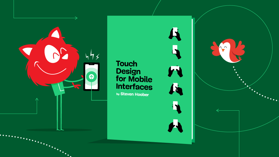
In our brand-new book Touch Design for Mobile Interfaces, Steven Hoober shares his in-depth research about designing for touch as well as tips, tricks, trends, tendencies, guidelines, and heuristics you can apply to your work immediately to create human-centered mobile interfaces. Jump to table of contents.
Download a free PDF sample (6MB)
Printed books will be shipped starting in late-December.
Get the book right away.
About The Book
There are over two billion portable touchscreen devices in use today, and hundreds of millions more installed in cars and kiosks. Sales of traditional mouse-and-keyboard computers have been falling for years, replaced by mobile phones and tablets.
Conventional computers now sport touchscreens and otherwise blur the lines between device types – and between mobile and desktop operating systems. Mobile and touch are the new computing normal, but there is a lot of myth, rumor, error, bias, and out-of-date information on how portable touchscreens are used.
Touch Design for Mobile Interfaces presents and shares real information on hardware, people, interactions, and environments. Steven Hoober has studied how people really touch and hold phones and tablets, as well as seeing it firsthand over twenty years designing products for mobile phones, tablets, kiosks, and computers.
As well as Steven’s in-depth research, the book includes tips, tricks, trends, tendencies, guidelines, and heuristics you can apply to your own designs immediately.
400 pages. Written by Steven Hoober. Cover design by Espen Brunborg. Shipping starting late-December.
Meet our new book “Touch Design for Mobile Interfaces”.
The history of touch and how it’s influencing traditional computing platforms still today,
how touch intersects with human behavior and impacts your design work,
how people really hold and touch,
how your designs can take into account the ways people adapt their touch to perform different actions,
how to overcome problems of visibility and interactivity,
how to avoid catastrophes when mistaken taps are made,
how to consider likely problems when planning the design of your app or website,
how to design UIs that attract the eye, afford action, and inspire confidence,
how human vision is not what it appears to be,
how to create well-organized, usable templates for touchscreen design,
the pros and cons of some of the most important page design elements (e.g., menus, lists, floating bars, tabs).
A sneak-peek inside the book. Large view.
This book is for digital-first designers working on mobile or touchscreen products. If you want to design better for mobile, or you need data to back up your decisions, this book is evidence-based, specific, and full of actionable information. If you want to move from desktop design to mobile, the book provides a path for you to reconsider design decisions for touch and mobility.
There are benefits too for product designers, managers, and analysts, as well as developers and engineers on mobile touchscreen products. You’ll be able to plan for the new touch-also world, write better stories and features, and understand how the work environment has moved from predictable computers in cubicles to devices everywhere, anywhere, and anytime.
Table Of Contents
How do people really use their mobile devices? And how can we design better mobile interfaces based on that knowledge?
The 13 chapters of our shiny new book explore just that.
The first chapter describes different devices in the context of their unique attributes of portability, connectivity, and awareness. We’ll come to understand how important it is to understand mobile technology and use patterns, and become aware that mobile paradigms are influencing more traditional computing platforms.
Chapter 2 reviews the evolution of direct screen interaction dating back to the 1950s, and the development of commercialized touch since the 1980s. Today’s devices can be better understood by learning how touch technology advanced before achieving ubiquity through capacitive touch.
Chapter 3 addresses how capacitive touch intersects with human behavior and impacts our design work.
We’ll learn how various standards, assumptions, and problems can be problematic for designers of today’s mobile touchscreens. The specifications, norms, and principles of earlier times are sometimes not to be trusted as they are too often based on technological assumptions that no longer apply.
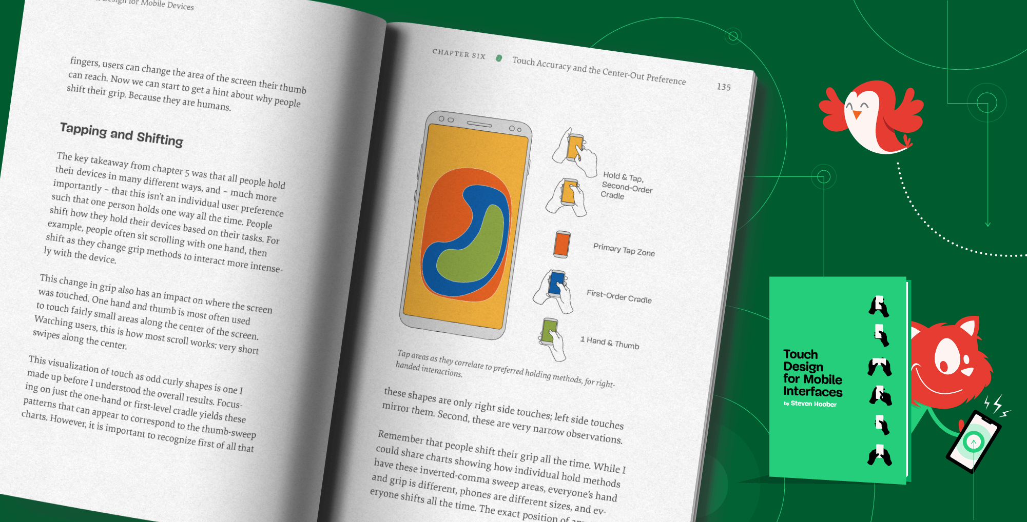
Chapter 5 covers the observational research Stevn Hoober conducted to discover how people actually manipulate their mobile phones and tablets in everyday use. Through debunking some widely accepted but incorrect assumptions, we’ll learn most of all to change the way we think about designing for touch, because while there are many ways to hold a device, everyone uses them all, constantly shifting from one to another.
To understand touchscreen performance, Steven undertook several studies and found that popular notions of touch accuracy and preferred touch regions are wrong. He discusses this in chapter 6 and shows that people favor the middle of the screen for both reading and touching.
Every mobile device user has experienced how fingers get in the way, and in chapter 7, you’ll learn how our designs can take into account the ways people adapt their touch to perform different actions like tapping and scrolling, and to overcome problems of visibility and interactivity.
Chapter 8 covers the issues around imprecision and probability and shows how we need to design systems, interactions, and processes that prevent mistakes — especially avoiding catastrophe when mistaken taps are made.
Mobile devices are used in all kinds of locations and people handle them constantly. People and their environments can be confusing, confounding, and unpredictable. Chapter 9 describes ways we can consider likely problems when planning the design of our apps and websites.
We start to move into tactics — with a little less theory, data, research, and background info. Chapter 10 covers best practices in how the UIs of interactive elements are designed to attract the eye, afford action, be readable, and inspire confidence that they can be safely tapped.
In chapter 11, Steven introduces the concept of information design, describes how human vision is not what it appears to be, and then turns all that we’ve learned so far into a simple formula we can all use to create well-organized, usable templates for touchscreen design.
Shifting from template theory to template creation practice, in Chapter 12, we’ll review the pros and cons of some of the most important page design elements, such as menus, lists, floating bars, and tabs, to see how they can integrate with the concept of information design for center-out touchscreen products.
We’ll finish off by skimming lightly over more or less the entire process of designing digital touchscreen products, from teams to strategy and onward. From these resources we can start building a reference library of how to pursue each aspect of the design process.
400 pages. The eBook is available right away (PDF, ePUB, Amazon Kindle). Shipping starting late-December. Written by Steven Hoober. Designed by Espen Brunborg.
About the Author
Steven Hoober shifted focus from graphic design to mobile UX in 1999. Since then, he designed the first Google mobile search, the first mobile app store, several mobile browsers, and numerous websites and apps for global brands. See more of Steven’s research at 4ourthmobile.com.
Reviews and Testimonials
“Eye opening and practical, but above all, useful. Steven synthesizes his extensive field observations with a deep technical understanding of touch usage and history. This book balances pragmatic guidelines and theory in a way that’s accessible, memorable, and highly referenceable. I now observe phone usage completely differently, but in a way that seems completely obvious in retrospect.”
— Lucas Roe, Design Lead, Vertex
“We live in a world of touch devices, and even those that don’t have user interfaces are sure to be activated with touch. Reading Steven’s book feels like you are taking a grand tour, full of wisdom and practical advice – and what to look for when designing and developing a real-world experience. And mind you, this book is not just for the creatives. If you are in the C-suite, do yourself a favor and read. It will boost your strategy to bring a good experience to your customers.”
— Mudassir Azeemi, Design systems, Ring Central
“Steven Hoober is a rare technologist with a penchant for explaining design patterns and heuristics in fascinating detail. His contextual background and respect for technology history shines through here, all the while shining a light to the future. He approaches design from a pragmatic and research driven approach. This book will be helpful and appreciated by the professionals that read this and take his advice. Filled with tactical advice grounded in research, this book is a must read for digital designers, app makers and UX professionals.”
— Chad Udell, Chief Strategy Officer, Float
Technical Details
ISBN: 978-3-945749-97-5 (print)
Quality hardcover, stitched binding, ribbon page marker.
Free worldwide airmail shipping from Germany starting late-December.
eBook is already available as PDF, ePUB, and Amazon Kindle.
Get the book right away.
Community Matters ❤️
Producing a book takes quite a bit of time, and we couldn’t pull it off without the support of our wonderful community. A huge shout-out to Smashing Members for the kind, ongoing support. The eBook is and always will be free for Smashing Members. Plus, Members get a friendly discount when purchasing their printed copy. Just sayin’! 😉
Stay smashing, and thank you for your ongoing support, everyone!
More Smashing Books & Goodies
Promoting best practices and providing you with practical tips to master your daily coding and design challenges has always been (and will be) at the core of everything we do at Smashing.
In the past few years, we were very lucky to have worked together with some talented, caring people from the web community to publish their wealth of experience as printed books that stand the test of time. Stefan and Adam are some of these people. Have you checked out their books already?
Everything you need to know about TypeScript, its type system, generics and its benefits.
100 practical cards for common interface design challenges.
A practical guide to designing and coding simple and inclusive forms.