

As technology increases its pace, so does the demand for new software to meet those needs increase. UI Design tools that make designs easier, faster, cheaper and still maintain quality are not only hard but becoming rare to find. In this chaotic yet organised designer life, a little clarity on how to make the process of design easier is what we’re going to discuss here.
In simple terms, UI (User Interface) Design helps the user i.e. people like you and me, to navigate across a website without any hassle. This is achieved through the visual communication of design. The user automatically knows the progression of the website. They are effortlessly guided towards the actions that the product/company believes would be right for the user.
Seems simple, right?
What seems simple is actually the hardest to accomplish in design.
Every creative understands how much percentage of the design is dominated by instinct and gut feeling. A graphic designer feels that the design looks right. It takes months of practice to get a workable formula running for success but gut feeling presides more often than none.
UI Design, on the other hand, requires more discipline. As we always say, “We’re bound by pixels”. The website pixies of the world will tell you that the pixels a.k.a px are a UI designer’s best friend.
That does not mean that UI Design cannot be fun. Au contraire, it’s more fun once you know the basic principles:
The end is more important than the means. So, your users decide the fate of your product and they decide what works for them, every single day. It’s about predicting the actions of your users before they can perform it. Therefore, it becomes a basic principle to keep your user in mind and what would work best in their favour.
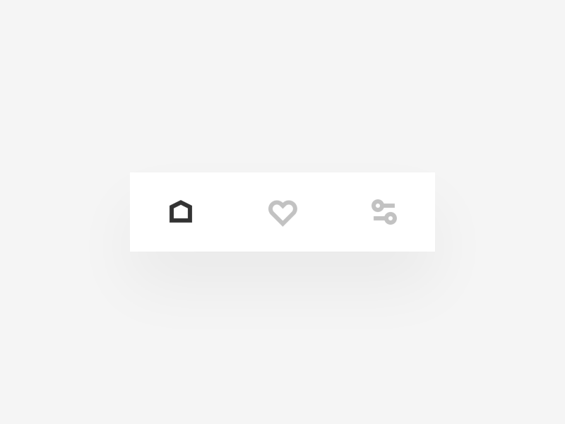
This means creating actions that would help them make their decisions easier. For instance, using icons that users can relate to and are universal in their application.
In every element, screen flow, interaction or iteration, the comfort level of the user has to be a priority. Therefore, your design should be simple to navigate and the flow of each element within the page/app should be effortless for the user.
Adding features that look cool and amazing is something we designers would love to achieve, but is it that feature going to help the end-user? The user should be able to navigate with ease and their intuition should lead them to the next step rather than unnecessary and complicated features. We wouldn’t want them not coming back to your website now, do we?

Tip: Two feet away. Try this rule. It is something that has helped me a lot before. The rule is to step two feet away after making a major element in your design and think like a user. Stepping away from your work gives you a new perspective to see your direction (good or bad) – something you may not realise while designing.
Keep it simple, stupid.
Any design that has to be explained inherently fails to achieve its mission. Keeping it simple has been a famous and classic principle. While many believe it is quite easy, simplicity is a quality that is the hardest to achieve.
The irony of simplicity being complex is not lost on all designers but is a quality that needs to be honed with practice. Designing with simplicity in mind requires many iterations and trials before you reach the right amount of simplification. Mostly because achieving designs that cater to the short attention span limit, lower load speeds, while having the most optimal features is hard to achieve in one go.
Yes, it is possible to over-simplify a website too. Keeping in mind your user, you might try to go completely minimal but not showcase the data necessary for the user to proceed. So, while it is feasible to keep it simple, try not to be stupid or skimpy with the details to achieve it.
It’s natural to forget. Even more, if you have a complex project that involves way too many screens, the probability of two different designs for the same element (call to action buttons, links, sliders) is higher.
Part and parcel of UI Design is disciplining yourself through consistency. This involves:

We are blessed (probably spoilt too) by the great designers and developers of Adobe (XD, Photoshop, and Illustrator), Figma and Sketch. Bringing us the ease of creating components (XD) and instances (Figma), we can keep consistency across the boards.
Great internet site! It looks extremely good! Keep up the excellent work!